Blog
Here’s what’s trending in industrial design colors for 2021
Posted in: Building Dimensions Blog
In the wake of an uncertain year, the right industrial design colors give us comfort
As we plan for industrial design in 2021, colors will play a key role in creating spaces that answer our collective, pressing need for calm after the storm. Color forecasts for commercial spaces anticipate a movement toward trends that provide comfort in the wake of a year of anxiety, grief and social unrest. And while color can’t fix everything, it can indeed create a mood, help soothe the weary, and create familiar, cozy, and welcoming spaces.
Industrial design colors take a different turn after 2020
In the dawn of 2020, color palettes skewed toward the bold, showcasing a sense of optimism and confidence for the new year. Pandemic uncertainty has created a shift in so many industries, and that includes the industrial design space. Here are the color trends we see for 2021.
Neutrals provide elevated comfort, with a nod toward mindfulness
As the public seeks out comfort, we’re seeing shades of brown sugar, ginger and beige take center stage with earthy accents of green, gray and soft blue. Textures are big here too, and again they lead toward comfort to create a cozy environment. These warm neutrals are great for larger gathering spaces, both indoors and out, as well as more private, comfy corners. In addition, we expect colors that are easy on the eyes to trend (particularly after a year of scrolling and abundant eye-straining screen time), including cool colors that take their cues from nature.
Hues creating harmony and positivity
While 2020 was a year of dissonance and often solitude, 2021 is leaning toward palettes that create a sense of unity and cooperation with an analogous trend. Look for collections of shades of the same color or similar colors to create a gradient effect. We’re also seeing monochrome palettes gain popularity, with a boost from a single color — often a bold shade. This creates a modern look of simplicity with a punch of expression.
Shades of optimism
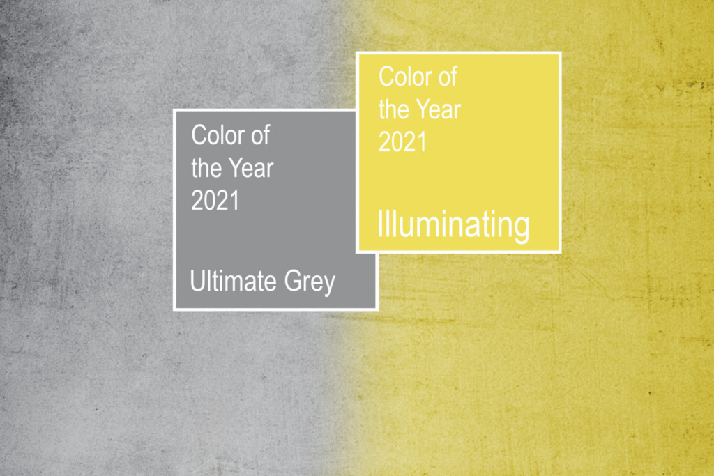
While it’s easy to smirk at the apparent optimism that fast wore off in 2020, color forecasts are also showing signs of optimism for the coming year. This upbeat outlook includes more vibrant colors such as warm saffron, magenta and turquoise, creating a deep, professional look with a kick. As a bonus, these hopeful shades can create a sense of happiness. Meantime, Pantone chose two colors of the year for 2021, reflecting a suggested balance of perseverance and hope. Ultimate gray (17-5104) embodies dependability and embraces natural elements like beach pebbles, while Illuminating (13-0647) communicates a sunny outlook for what’s ahead.
Making space for whatever’s next
When it’s time to create a space for whatever’s next, working with a design-build team can help you focus on the trends that work best for your commercial construction. From inspiration to celebration, the design-build model of construction ensures everyone who works on your project is on the same team, working with a shared vision in mind. And that’s sure to color your project in winning shades.


